Grafana is an open-source platform used to turn operational data into visual dashboards that are easy to interpret and act on. Instead of working with raw metrics, users can build real-time views of system behaviour across servers, applications, and infrastructure.
It is commonly used in environments where large volumes of performance data need to be monitored and understood quickly, helping teams track system health, user activity, and service performance in one place.
One of Grafana’s key strengths is its ability to create dynamic dashboards that pull data from multiple sources. This gives users a unified, real-time view of system performance across different parts of an infrastructure, helping teams identify trends and spot issues quickly.
Grafana supports a wide range of data sources, including Prometheus, InfluxDB, MySQL, and Elasticsearch, making it easy to integrate into existing monitoring environments. This compatibility allows it to act as a central layer for visualising and analysing data across tools and platforms.
Although Grafana offers powerful functionality, it can feel complex at first due to its broad range of features and configuration options. Once set up, however, it becomes a highly effective way to monitor systems and build tailored dashboards for different operational needs.
This guide to getting started with Grafana will cover installation, configuration, and core features to help you get up and running quickly. It also introduces key capabilities such as alerting, annotations, and dashboard sharing, enabling you to make full use of the platform’s monitoring potential.
Overview of Grafana
Grafana is a multi-platform open-source platform for monitoring and observability. When connected to a supported data source, it enables you to easily visualize and make sense of them.

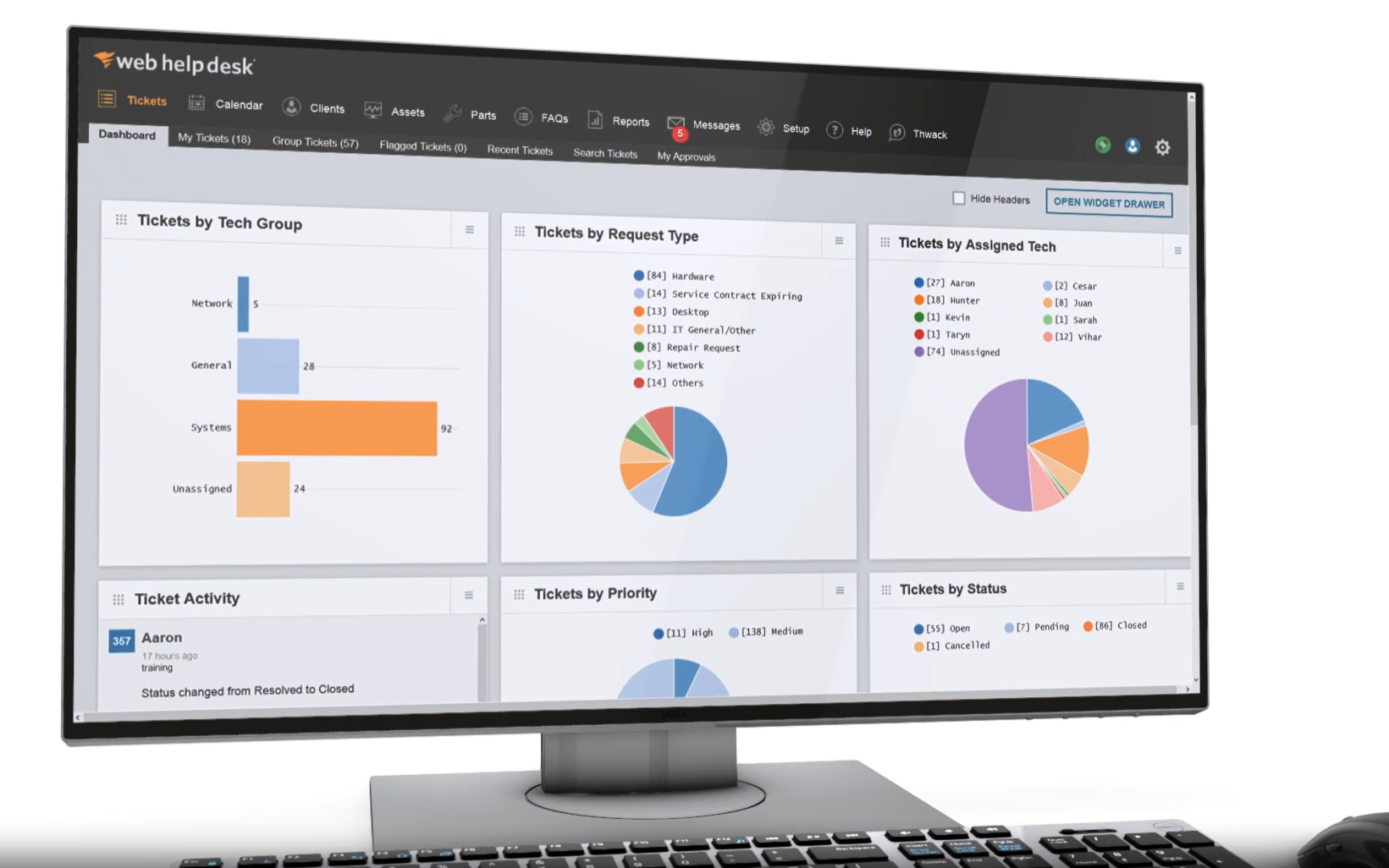
Grafana provides charts, graphs, and alerts, and helps you understand your metrics irrespective of their location. Not only do Grafana dashboards help you make sense of data from various sources, but it also allows you to share and explore the dashboards you create with other team members.
Some typical use cases include:
- Visualization of data generated by network monitoring tools such as Zabbix, PRTG, Icinga, Checkmk, and others.
- Visualization of the CPU, memory, network, and other resource utilization.
- Visualization and alert for a high number of incoming web requests in your web app.
- Monitoring the health of the components of your platform like APIs, frontend apps, databases, etc.
Time series data is the supported type of data for monitoring and visualizing in Grafana. This is why it is often used in combination with time series databases or time series database-supported tools such as InfluxDB, Prometheus, and Graphite.
Key features and capabilities include:
- Visualizations Supports flexible visualizations that allow you to visualize your data in a range of formats such as heatmaps, histograms, graphs, and geo maps.
- Plugins The real power of Grafana is in its extensibility properties. Plugins can be used to extend Grafana’s existing capabilities or add new data sources and widget types.
- Alerts This allows you to create, manage, and silence all of your alerts within one simple UI.
- Transformations Transformations allow you to rename, summarize, combine, and perform calculations across different queries and data sources.
- Annotate Allows you to annotate graphs with rich events from different data sources.
- Panel editor The panel editor makes it easy to configure, customize, and explore all of your panels.
- Collaboration This allows you to easily share insights from Grafana dashboards across your company, team, and the world.
Grafana comes in three editions: a free open-source version, a fully managed cloud service, and an enterprise edition for organizations that need a self-managed environment.
Installing and Configuring Grafana
The Grafana open-source and enterprise editions are self-managed and can be run on your infrastructure. To deploy Grafana on-premise, you must meet the minimum software and hardware requirements (255MB memory and 1 CPU core), including a supported database (such as SQLite 3, MySQL 5.7+, PostgreSQL 10+) and a modern web browser. Supported OS include Debian/Ubuntu, RPM-based Linux (CentOS, Fedora, OpenSuse, RedHat), macOS, and Windows.
Grafana can be installed on any of the supported OS such as Debian/Ubuntu, RPM-based Linux (CentOS, Fedora, OpenSuse, RedHat), macOS, and Windows using native packages.
You can install and run Grafana Enterprise or Grafana Open Source using the Docker images which are available for Alpine and Ubuntu. For details on deploying the Grafana docker image please check out the official documentation page.
On the other hand, the Grafana Cloud is the quickest means to get up and running with Grafana, and it includes a scalable, fully managed backend for metrics, logs, and traces. You can use Grafana Cloud to avoid the overhead of installing, maintaining, and scaling your observability stack.
Grafana Cloud is managed and administered by Grafana Labs with free and paid options for individuals, teams, and large enterprises. It includes a robust free tier with access to 10k metrics, 50GB logs, and traces for 3 users. Grafana Pro offers a free 14-day trial with Unlimited metrics, logs, traces, and users, long-term retention, and premium team collaboration features. There are no installation and configuration hassles. All that’s required is to sign up for a Grafana Cloud account, and you are good to go.
Connecting Your Data to Grafana
Once you’ve created a Grafana Cloud account, the next step is to add your data source and connect it to your Grafana stack. Grafana supports many different storage backends for your time series data sources. However, only users with the admin role can manage data sources. You can connect to your data source using one of three primary methods, depending on what service or database is producing the data and how you want to use Grafana Cloud to work with that data. These three primary methods are described as follows:
1. Integrations method
The integration method is ideal for monitoring the infrastructure of service with pre-configured dashboards and alerts, while Grafana manages the data. Integration is achieved via direct connection to your SaaS application or by using Grafana agents. Grafana Cloud offers many integrations to monitor the health and performance of services such as operating systems, databases, Cloud apps, and more. When you use the integration method, your data will be shipped to your cloud account, and you’ll get access to pre-configured dashboards and alert rules, tailored to the service you’re scraping. The following is a step-by-step process for installing an integration:
- In your Grafana Cloud stack, click Integrations and Connections.
- Search for the name of your service. Some services have both an infrastructure integration and a data source.
- Click on the appropriate tile and follow the instructions
2. Data sources method
When you want to query, alert, and visualize service data in your local environment, the data source method is recommended. Grafana data source connections give you a way to centralize data stored on various platforms. When you can act on your data in one place, you can build queries across multiple data sources and display the results in dashboards without leaving your Grafana Cloud stack. With any Grafana Cloud account, admins have automatic access to many natively supported data sources as well as many data source plugins created by the open-source community.
When you want to connect to a data source that is natively supported by Grafana, you can search for and click the data source in Integrations and Connections and follow the instructions. If the data source you want to connect to is supported by a community or Enterprise plugin, first install the plugin, and then the corresponding data source using the steps below:
- In your Cloud stack, hover over the Configuration (gear) menu and select Plugins.
- Use the search field or scroll to find the tile for the plugin that matches your data source.
- Click Install via grafana.com.
- When you’re directed to grafana.com, ensure you’re signed in to your account and click Install.
- Return to the stack where you installed the plugin, sign out, then sign back in.
- In the Configuration menu, select Data sources.
- Click Add data source and search for the data source for the plugin you installed previously.
- Configure your connection.
3. Custom connections method
The custom connections method is recommended for scenarios where you want to scale and manage existing observability deployments in Grafana Cloud. When you connect your observability data to the Grafana backend and ship your data to Grafana Cloud, you can take advantage of centralized and long-term data storage, aggregated datasets, and secure global access without complicated customizations. You can also deploy Grafana Agent to manage and scale your infrastructure without the need for local storage.
According to Grafana documentation, installing integrations is the easiest way to send your data to Grafana Cloud, but other methods might be more appropriate depending on your local deployment. For example, if you are already collecting observability data with Prometheus, Loki, and Tempo, but want a single place to store, manage, and act on it, you might choose to deploy Grafana Agent manually. Or, depending on your needs, you might want to use a different method. Grafana supports Prometheus, Graphite, InfluxDB, and Datadog metrics.
Grafana Metrics and Visualizations
Metrics are measures of quantitative assessment commonly used for comparing and tracking performance. In a computer network, for instance, network metrics such as bandwidth usage, packet loss, jitter, latency, and others are qualitative and quantitative ways to observe and determine network behavior. Network performance metrics can help provide you with a more profound understanding of end-user demands, and how your network infrastructure and services are operating. They can provide real-time insights into the potential issues, outages, and errors of the network, and help you create an adaptive network to meet future business needs. With this crucial information, you can deploy and prioritize IT resources to respond according to the impact.
Grafana metrics and visualization make it easy to visualize data generated by network monitoring tools such as Nagios, Zabbix, PRTG, Icinga, Checkmk, and others. Grafana metrics are most useful when they are captured repeatedly over time. This allows you to make data-driven comparisons. Metrics like these are stored in a time series database such as Prometheus, InfluxDB, and others. Grafana Cloud can accept these time series databases, including their different metrics formats for visualization. Grafana and Grafana Cloud offer a variety of visualizations in the form of graphs & charts, stats & numbers, widgets, and more to suit different use cases. Grafana graphs & charts visualizations are described as follows:
Time series visualization

Time series visualization is Grafana’s default and primary way to visualize time series data as a graph. It can display almost any time-series data and render them as lines, points, or bars. Check out this public demo dashboard to learn more about the many different examples of how time series visualization can be configured and styled.
State timeline visualization

State timeline visualization for state changes over time. This type of visualization displays state changes that occur over time at the state timeline panel. The panel supports data formats such as string, boolean states, and time series data. When used with time series, the thresholds are used to turn the numerical values into discrete state regions. Each series is rendered as its unique horizontal band.
Status history visualization

The status history visualization shows periodic states over time. It supports data formats such as string, boolean, and numerical fields or time series data. Each field or series is rendered as a horizontal row as shown below.
Bar chart visualization

This panel visualization allows you to graph any categorical data. It supports only one data frame and it needs to have at least one string field that will be used as the category for the horizontal axis (X) or vertical axis (Y) and one or more numerical fields. If there are m multiple time series or tables you first need to join them using a join or reduce transform feature.
Histogram visualization

A histogram is a graphical representation of the distribution of numerical data. It groups values into buckets and then counts how many values fall into each bucket (frequency). Grafana histogram visualization only looks at value distributions over a specific time range. It calculates the distribution of values and neatly presents them as a bar chart. The histogram uses bar height to represent frequency. The histogram in Figure 6.0 below shows the value distribution of a couple of time series which peaks between the 260-280 value range.
The vertical axis (Y) and the height of each bar represent the frequency or count of values that fall into each bracket or bucket, while the horizontal axis (X) represents the value range. Histogram visualization supports time series and any table results with one or more numerical fields. Histograms The problem with histograms is that you cannot see any trends or changes in the distribution over time. This is where heatmaps become useful.
Heatmap visualization

A heatmap allows you to view histograms over time, where each time slice represents its histogram. It uses cells and cell colors as a representation of frequency. It colors the cell in proportion to the number of values in the bucket or bracket.
The color spectrum controls the mapping between frequency (value count) in each bucket and the color assigned to each bucket. The color on the far left of the spectrum represents the minimum count and the color on the rightmost side represents the maximum count.
Pie charts visualization

These are typically used where proportionality is important. The pie chart displays reduced series, or values in a series, from one or more queries, as they relate to each other, in the form of slices of a pie. The arc length, area, and central angle of a slice are all proportional to the slice’s value, as it relates to the sum of all values. This type of chart is best used when you want a quick comparison of a small set of values in an aesthetically pleasing form.
Candlestick visualization

This is typically for financial data where the focus is price/data movement. The Candlestick panel allows you to visualize data that includes several consistent dimensions focused on price movement. The Candlestick panel includes an Open-High-Low-Close (OHLC) mode, as well as support for additional dimensions based on time series data.